At a Glance
| Client | Capuchin Coffee Roasters |
| Industry | Specialty Coffee Roasting & Bean-to-Bar Chocolate, Romania |
| Challenge | Growing business, fragmented identity, new product lines launching with no packaging or brand direction |
| Solution | Complete rebrand: visual identity, naming, mascot, packaging system across 6+ product lines, digital assets, e-commerce website |
| Revenue at Start | ~€1.3 Million |
| Revenue at Completion | ~€2.4 Million (85% Growth) |
| Timeline | 2.5 Years |
| Locations | 1 shop to 3 cafes + mobile beverage truck + production warehouse |
About Capuchin Coffee Roasters
Capuchin Coffee Roasters is a specialty coffee roaster and bean-to-bar chocolate producer based in Romania. Founded with a clear craft and artisan ethos, the company is obsessive about quality at every stage of production, from sourcing raw materials to the experience inside their cafes.
When the project began, Capuchin operated from a single location, generating around EUR 1.3 million in annual revenue. Their product offering covered roasted coffee and a selection of third-party teas. The team was small, the ambitions were large, and the brand they had was not keeping up. They were entering their growth stage.
Romania’s specialty coffee scene has been growing steadily, and with it, the competition. Brands were getting more sophisticated visually, customers were getting more discerning, and the window for establishing a strong national presence was not going to stay open forever.
The Challenge
What they came in saying
Capuchin knew something was wrong. Their old visual identity had no connection to whom they had become. Product packaging was inconsistent. Each line looked like it had been put together at a different time by a different person. Store menus, signage, and identity materials were similarly misaligned.
They were also standing at a significant crossroads. Two major new product lines were about to launch, their bean-to-bar chocolate made from raw cacao beans, as well as hot chocolate shavings. These were not small additions. They were category expansions that required their own packaging systems, their own visual languages, and their own place within a brand that did not yet exist as a coherent whole.
They did not know where to start. That isn’t a criticism levied at the founders. Most growing businesses in this position do not. They had built something real, however they just lacked the strategic framework to build around it.
What the Brand Evaluation revealed
Capuchin did not have a brand problem in the conventional sense. They had a brand architecture problem, or more specifically a Brand Strategy problem. The issue was not that any single asset was terrible. Rather it was that nothing connected. They had individual pieces created reactively over time, with no system tying them together.
The more product lines that launched, and the more locations that opened, the worse this fragmentation would get. Each new touchpoint would add to the confusion rather than reinforce the brand.
Their ambitions were clearly regional-to-national. They wanted to ship across the EU. They were thinking about franchise opportunities. But a brand built from disconnected parts cannot scale. It buckles under the weight of growth.
What staying still would have cost them
Capuchin had two new product lines ready to launch, a merchandise line and a branded accessories line. Furthermore, they had to contend with their outdated coffee packaging. Without a coherent brand system, those launches would have deepened the fragmentation rather than resolved it in any meaningful way.
The specialty coffee packaging market, even at the EU level, had become genuinely competitive. Getting onto shelves or into the hands of discerning buyers required packaging that could stand up to professional comparison.
The decision was not really between rebranding or not rebranding. It was between building the right foundation now, or paying a far higher price to fix a compounded problem later.
Why a Full Rebrand was the solution
The clearest indicator that Capuchin needed a full rebrand rather than a refresh was the scope of what they were working with. Six or more product lines requiring distinct packaging, two of which did not exist yet. Multiple physical locations. Digital assets and e-commerce. A mobile truck. Signage. Merchandise. Trade show exhibition.
The full-service model also mattered here. Having one team responsible for Brand Strategy, Brand Identity, Packaging, Digital, and Production means every decision made in one area aligns with the overall vision and the proposed strategy. The packaging designer knows the brand story. The web developer knows the color palette rationale. Nothing is designed in isolation, and nothing gets lost in translation between different agencies.
The Approach
Phase 1: Brand Strategy and the Explorer Concept
Before anything was designed, the brand needed a story. A genuine conceptual foundation that could anchor every decision that followed.
The Capuchin monkey was already in the name. What had not been explored was the full potential of what that animal represents. The Capuchin monkey is a new world primate, native to many of the primary coffee-growing regions of the world. It is curious, exploratory, and highly intelligent. It lives where coffee grows.
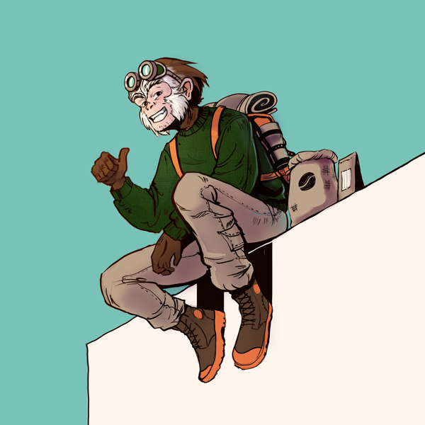
The strategic direction: build a brand character around this. A Capuchin explorer, humanized with aviator goggles and a flight suit, evoking the spirit of early aviator adventurers. Someone who travels from origin to origin, discovering the world’s finest coffees and bringing them back. An explorer with taste.
This was not just a mascot or generic decoration. It was the answer to the question every brand must answer: Why does this company exist, and what does it stand for? Capuchin stands for discovery, craft, and the pursuit of exceptional raw materials. The mascot made that tangible.
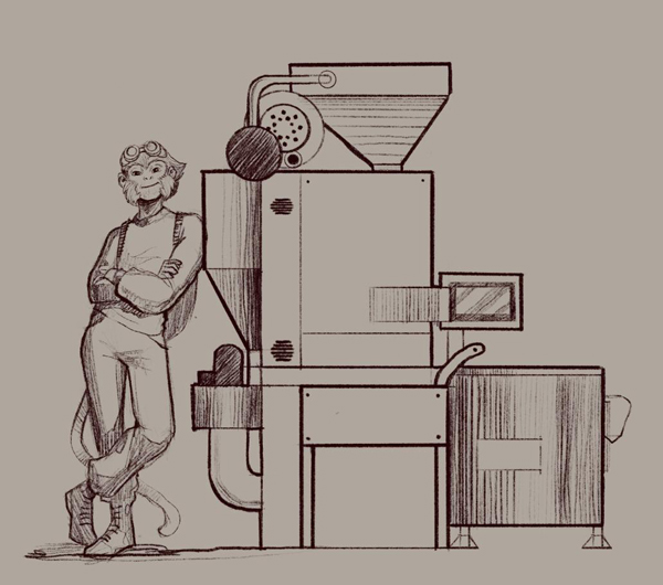
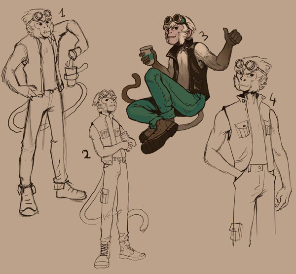
Early character development
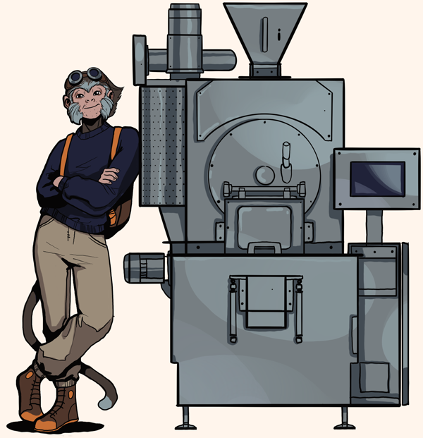
Phase 2: Visual Identity and the Brand System
With the brand story established, the visual Brand Identity work began. This included the full naming treatment, logo design, color palette, typography selection, and the complete Brand Identity Guide that would govern how the brand appeared across every touchpoint.
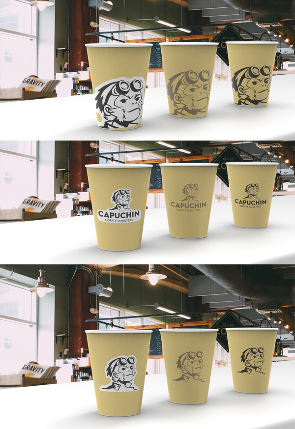
The identity had to work across an unusually wide range of applications, from specialty coffee bags to chocolate bars, from ceramic cups to vehicle wraps. The system needed to be flexible enough to accommodate this range while remaining immediately recognizable as Capuchin in every context.
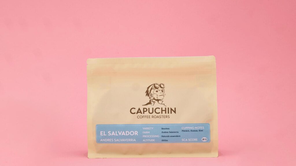
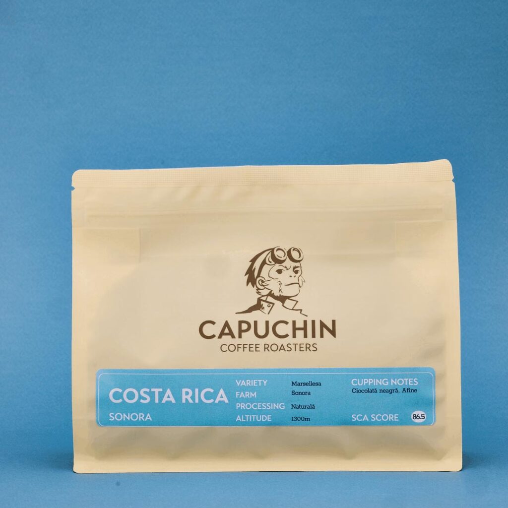
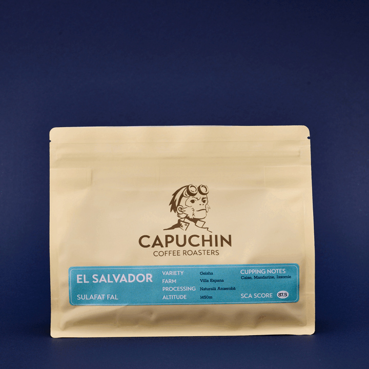
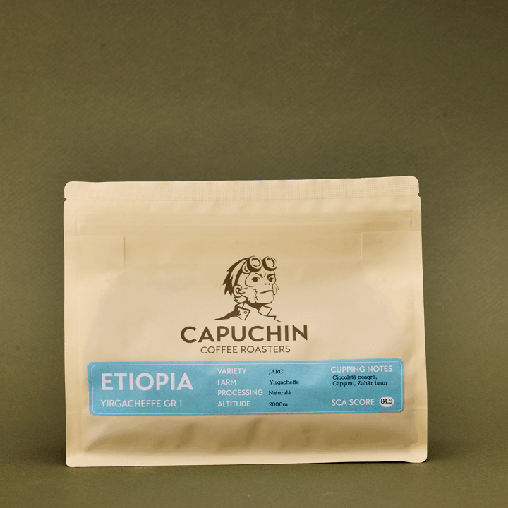
Phase 3: The Product Packaging (A core foundational problem)
This was the most complex part of the engagement. Creating packaging for six distinct product lines that each feel unique to their category, while remaining unmistakably part of the same brand family is genuinely difficult.
Most packaging projects involve one or two product lines. This was a system design challenge at a different scale.
The product lines requiring full custom packaging:
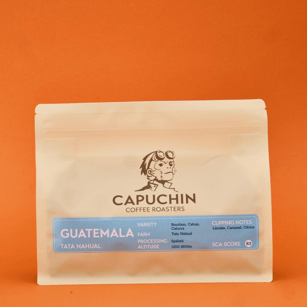
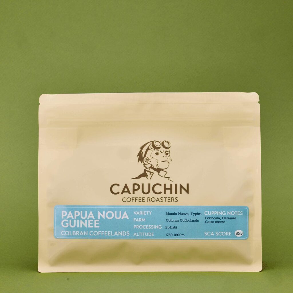
- Specialty roasted coffee bags
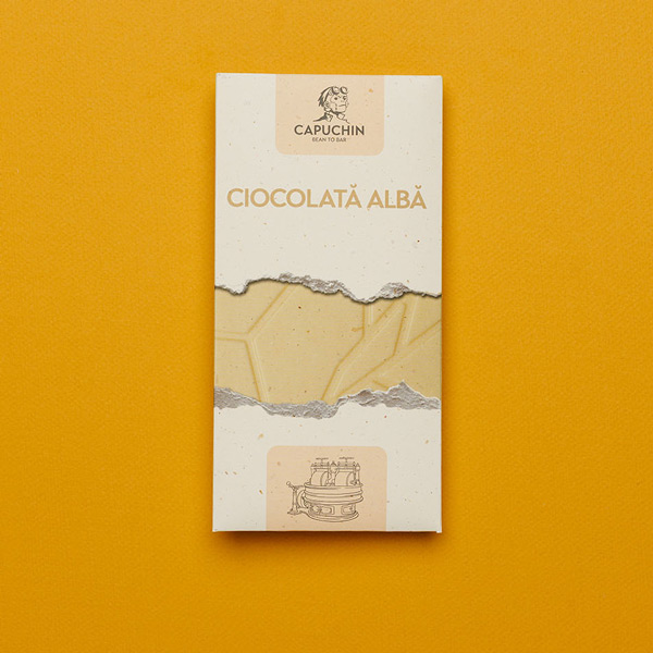
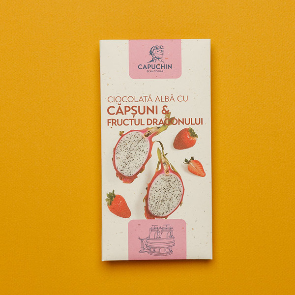
- Bean-to-bar chocolate bars
- Specialty tea selection
- Ready to make hot chocolate shaving
- Custom merchandise
- Custom ceramic cups
Each line needed its own visual language, its own hierarchy, its own way of communicating what made it special. And all of them needed to feel like they came from the same place.
The proof of concept came when the first prototype coffee bag samples arrived. Both teams knew immediately. The packaging could stand alongside the best specialty brands in the market. That was the confirmation that the system was working.
Packaging: Custom coffee bags
Packaging: Custom die cut chocolate boxes
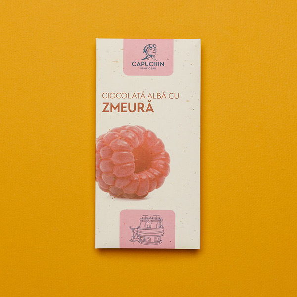
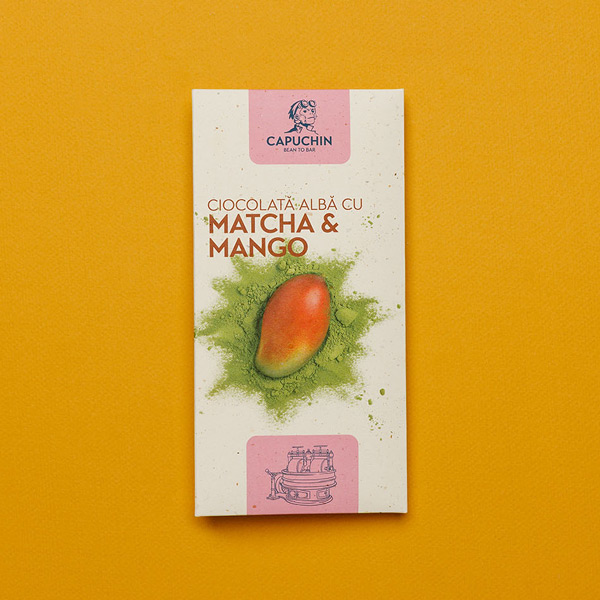
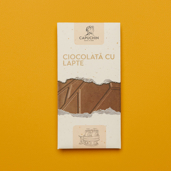
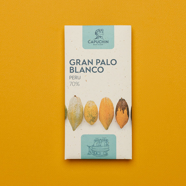
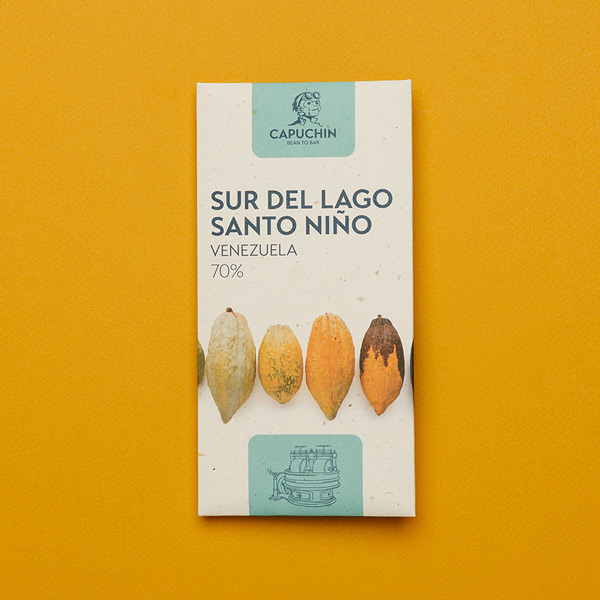
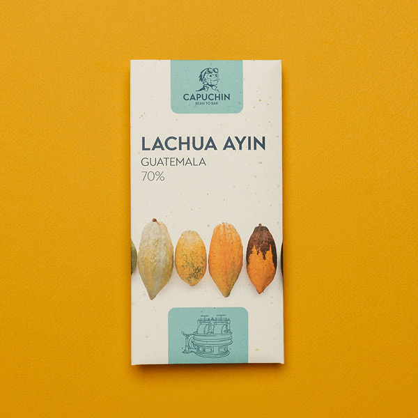
Various packaging
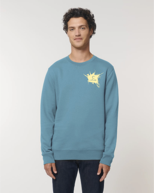
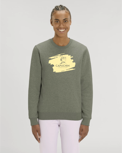
Merchandise: Capuchin wear


Phase 4: Digital Assets and E-Commerce
Brand expression in the digital space required its own dedicated approach. Custom stop-motion animations and product photography were produced to match the craft and artisan positioning of the brand. Videography captured the story across brand and product contexts.
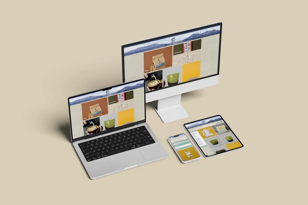
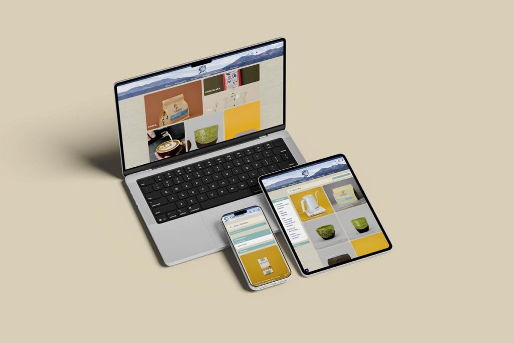
The e-commerce website was built from scratch with bespoke design and custom animations. The goal was not just to sell product online. It was to create a digital space that felt like an extension of the physical Capuchin experience and communicated the brand’s quality before a single product was in the customer’s hands.
The custom e-commerce platform

The commercial visuals production
Phase 5: Environmental and Operational Branding
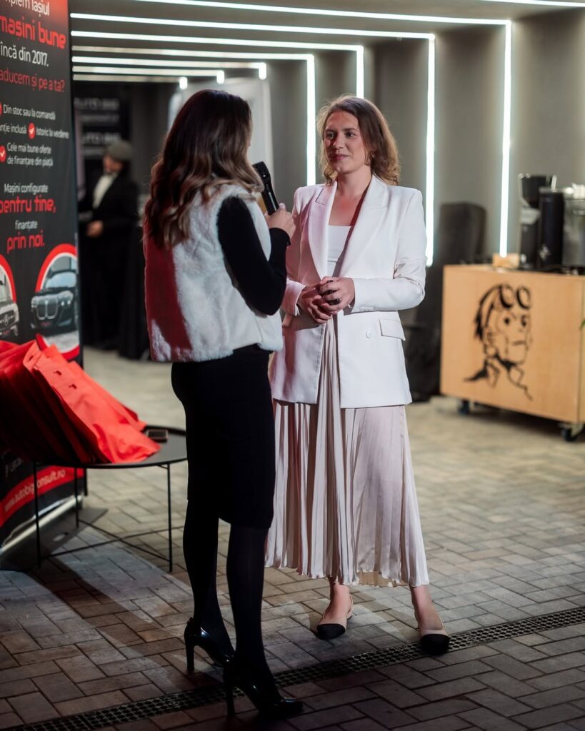
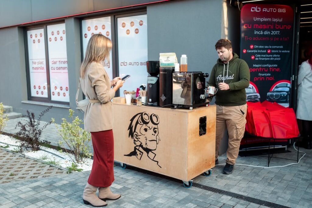
As Capuchin grew, new physical and operational touchpoints required consistent treatment. Store menu design, outdoor signage, and the vehicle wrap for the mobile beverage truck were all developed within the same brand system. Fizzy Drink also designed the trade show stand for Capuchin’s presence at the national specialty coffee festival the company went on to found independently.
The Results
| Metric | Before | After |
|---|---|---|
| Revenue Growth | EUR 1.3M to EUR 2.4M | 85% over 2.5 years |
| Physical Locations | 1 coffee shop | 3 cafes + mobile truck + warehouse |
| Product Lines | 2 (coffee + 3rd-party teas) | 6+ with custom packaging across all |
| Market Position | City-level regional brand | Top 5 Specialty Coffee Roasters in Romania |
| Distribution | Local only | EU-wide shipping |
| Industry Presence | Exhibitor at 1 trade show | Founder of own national coffee festival (2 years) |
Revenue grew from approximately EUR 1.3 million to EUR 2.4 million over the 2.5-year period. That is 85% growth during the window of the rebrand engagement.
The physical business expanded from one small location to three cafes, a mobile beverage truck, and a dedicated production warehouse for coffee roasting and chocolate manufacturing.
The product offering grew from roasted coffee and third-party teas to six distinct product lines, all with custom packaging, all shipping EU-wide.
In terms of market position, Capuchin moved from a city-level regional brand to one of the Top 5 Specialty Coffee Roasters in Romania by market recognition.
They went from being an exhibitor at a single specialty coffee trade show to founding and running their own national specialty coffee festival, now in its second consecutive year.
Perhaps the most telling indicator of where the brand now stands: Capuchin is actively preparing for new product line extensions and evaluating franchise store opportunities. That kind of expansion requires a brand system that can accommodate growth without starting over. They have that now.
In Their Own Words

“Once all our packaging was created and the digital assets went live, we knew we had everything we needed for further growth. We now had a brand we could stand shoulder to shoulder with the leaders in our market.”
Alex & Emi, Founders at Capuchin Coffee Roasters
Key Takeaways from this Case Study
A brand system is infrastructure, not decoration.
Capuchin’s growth required a system that could accommodate six product lines, three locations, EU distribution, and a national festival presence. A logo refresh would not have touched any of those problems.
The hardest branding challenge in food and beverage is coherence across product lines.
Getting six distinct product categories to feel individually ownable and unmistakably part of one brand is a system design challenge, not a design talent challenge. It requires strategy before it requires aesthetics.
Brand strategy precedes design.
The Capuchin explorer concept was the decision that made every subsequent design choice faster, more coherent, and easier to defend. Without it, the packaging would have been well-executed guesswork.
The moment packaging holds its own against the market leaders is the moment a brand becomes a real competitive asset.
That prototype coffee bag was both a design milestone and a business milestone. It signaled that the Brand was mature and ready to launch.
Strong brands enable business decisions, not just marketing decisions. Capuchin’s ability to expand locations, launch new product lines, pursue EU distribution, and now explore franchise opportunities is directly connected to having a brand system built to scale.
Frequently Asked Questions
- How long does a full rebrand take for a food and beverage (CPG) company?
- The Capuchin Coffee Roasters rebrand took around 6 months from initial brand strategy through initial launch. Further implementation across all product lines, digital assets, and physical locations took approximately 3-6 more months. Timeline varies significantly based on the number of product lines, packaging complexity, and the scope of digital work involved.
- How much can a rebrand impact revenue for a specialty food or beverage brand?
- In Capuchin’s case, revenue grew from approximately EUR 1.3 million to EUR 2.4 million over the engagement period. Results depend on the quality of execution, the strength of the underlying product, market conditions, and how completely the new brand is implemented across every touchpoint.
- What does a full-service branding agency handle for an F&B client?
- A full-service agency covers everything from brand strategy, naming, through visual identity, packaging design for multiple product categories, digital assets, copywriting, e-commerce website development, signage, and production assets including photography, video, and animation. All of it under one creative direction.
- Can a rebrand help a regional brand compete nationally or internationally?
- Capuchin went from a city-level brand to one of Romania’s Top 5 Specialty Coffee Roasters and now ships EU-wide. The packaging system and brand coherence were both directly enabling factors in that transition.
- What does a rebrand of this magnitude cost?
- A full rebrand engagement of this scope covering brand strategy, visual identity, packaging across multiple product lines, digital assets and production, typically represents an investment in the EUR 50,000 to EUR 150,000 range depending on complexity.
Projects of this nature are scoped individually following a discover call and Brand Evaluation.
Is Your Brand Ready for What Comes Next?
Capuchin came to Fizzy Drink knowing their business had outgrown their brand. They did not know where to start. That is exactly where we begin.
If you’re a growth stage company in CPG and your product lines, packaging, or visual identity are no longer keeping pace with where your business is going, the first step is getting clarity on what you actually need and why.
Your growth is real. Your brand should keep up with it.
Get in touch with the Fizzy Drink team.